Labels

Showing posts with label Emma. Show all posts

Wednesday, 21 February 2018

Unit 4 Assignment: Creative Media Production Management Project

Scenario: Your have been commissioned by BBC North East to create an appropriate media product based on the theme ‘Life in the North East’.

Task 1 - Development of Ideas for a Creative Media Product

You will effectively (updating individual production diaries):

  • identify the target audience you need to address
  • identify the range of resources and materials available to you
  • identify the skills you have those that will develop from the production
  • mind map a number of appropriate ideas
  • identify the production management requirements for each idea
  • decide which idea might be appropriate
  • undertake research into appropriate content based on the target audience
  • undertake research into appropriate production techniques
  • identify potential constraints on production
  • identify ways to address constraints

Task 2 - Preparing a Pitch

You will:

  • finalise ideas for their media product
  • prepare a proposal
  • prepare a presentation including delegate notes and presenter’s notes
  • give the presentation in the form of a pitch to your client and take note of feedback
  • refine ideas as a result of the pitch, where appropriate.

Task 3 - Managing the Production

You will:

  • determine production roles (if employing a team or working in a group*)
  • complete pre-production process
  • complete production process
  • complete post-production process
  • show rough cut or draft product to focus group
  • make changes to finished product, where necessary.


Development of Ideas

The following is a mindmap of some initial ideas I had based off of the theme of ‘Living in the North East’.


The two ideas that stand out the most to me is the website and history, as I love my history and have previous experience with Wix editor when it comes to create a website. With this in mind, I can get about identifying and profiling my audience, look into what demographic would be best targeted. BARB website may help; however, this mostly surveys TV audiences and may not be very telling for internet audiences. Another source, Google analytics, may be more appropriate, as it inquires about people’s search history and uses this as a basis. Still, this is very broad, so a more local source would be appropriate. Teesside University’s Demographic change in the North East England would be more appropriate, or perhaps the Regional Profiles: Key Statistics PDF file.

Skills that will be appropriate to this task with be research techniques, planning, formatting, writing and web design, all of which I have experience with and have adapted to throughout this two year course. Production management requirements would include organizing said website, as well as appropriating articles on seperate tabs depending on the section of history. Production techniques would include research into secondary sources, as well as quantitative research based off of empirical research, or qualitative research which can be more subjected upon findings.

I see no reason as to why there should be constraints on my project, so long as I do not plagiarize or out right steal my information, as well as cite my sources where appropriate, and approach the subject with respect for history and culture. Have been commissioned by BBC North East to accomplish this task, I can rely on their rules and regulations, in addition to counting on them for advertising my product to their own audience. Speaking of which, let’s have a look at the target audience and demographic of BBC North East. The BBC Trust Service Review on local radio and news in the North East would be an appropriate source to cite.

Preparing a Pitch

I have finalized that my media product will be online based, a website with research and information about the North East of England.

Proposal

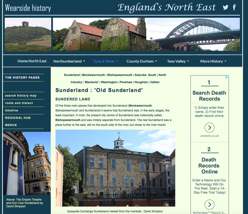
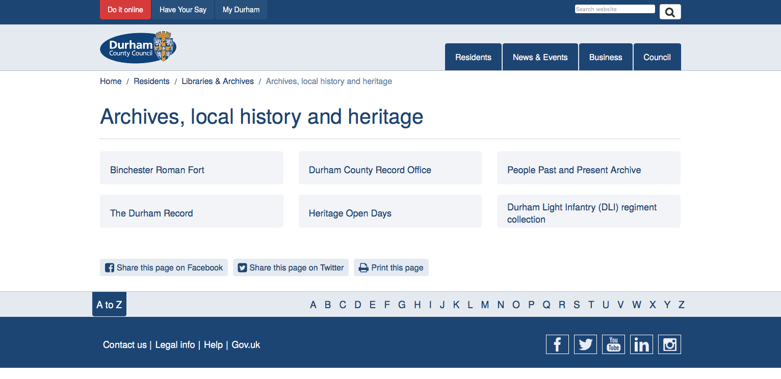
The outline of my product is as follows: a history based website concerning that of the North East, for those interested in learning about our rich heritage as a region. I believe this could not only inform the people of our region to the history of the North East, but also expose it to tourists that traffic in and around the county Durham, city of Sunderland and Tyne & Wear. Exemplar history sites of the North East region include the following:


Obviously, the one thing these websites all have in common (and will have in common with mine) is that they concern history and the specific history of the North East region. However, they all vary in design, style and format, some looking more professional than others.


Perhaps the most interactive and unique of these websites is ‘A History of the north east in 100 places’, linked last in my list.


Once you click the ‘Explore places>” option, it takes you to the following page where you can select a number of landmarks to view.


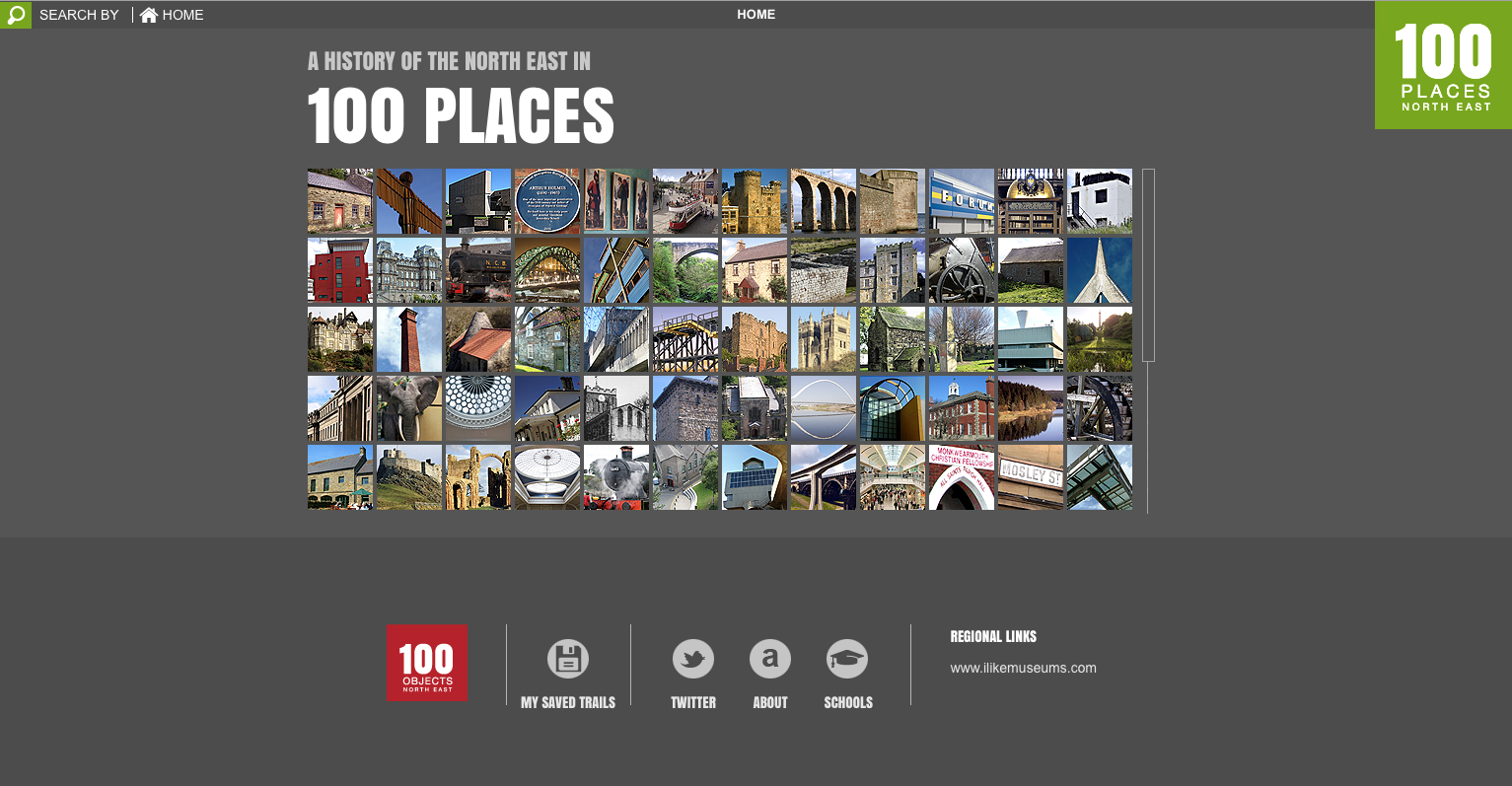
This format is simple to follow yet also very professional looking and modern, which can appeal to a younger demographic perhaps put off by the more old fashioned or formal websites.

Colours are often bold and dark, brooding even; however, the ‘100 places’ one is more light in tone with an undertone of grey. Looking at this, I may choose to also blend these styles with a more, dare I say, ‘original’ red/burgundy color scheme with appropriate colors to match (I’m thinking black and white). But how does this all tie into my proposal? Well, I have outlined what I think of these websites and believe, that by identifying these components, I can better use to utilize my own website to its fullest potential. I intend to place citations for my sources when it comes to the articles.

The target audience, of course, would be situated towards those already inhabiting the North East, as well as those coming to visit (tourists). BBC North East, being the company that has commissioned me to make this project a reality, would also help to promote towards the demographics of the region, ensuring their internet traffic audience either views or at least is made aware of the websites existence.

According to the report Demographic change in the North East England by Tony Chapman and Michael Jackson (no not the singer), “Demographic change: key indicators 2004- 2029 | The population of the North East is expected to remain fairly static over the next twenty-five years, with the revised projected increase in population being only 19,500 from its estimated level in 2004 of 2,542,200, an increase of only 0.8% compared to 11% nationally.” So then, between now and 2029 we can expect at least an uptick in population growth, hopefully with more people exposed to advertising of the website.

Meanwhile, the Regional Profiles: Key Statistics PDF file (report by Office of National Statistics) says, “The North East covers 8,600 square kilometres (sq km) and is the smallest region or country in the UK outside London in terms of area… Population density in the North East in mid-2010 was 300 people per sq km, below the England average of 401 but above the UK average of 257.” Population is sparse in the region; that said, I believe that if the BBC North East programming were to promote our product, we could make a viable product. It all depends on the content and whether or not it is worth revisiting.

Managing the Production

With pre-production and the pitch out of the way, it is at this stage where I actually begin production of my website and the information on it. Production roles will all be exclusively mine to undertake, given this is a one man project. That said, the roles include:

  1. Web designer
  2. Writer
  3. Producer

These will be the roles I will have to undertake in order to complete my project. Henceforth, from now on I shall be documenting the production process of my project (writing and web design). The following is a link to my website: https://mattytulip.wixsite.com/earl-of-durham
The following is the template for my history website, chosen from the CV/Personal Portfolio section.


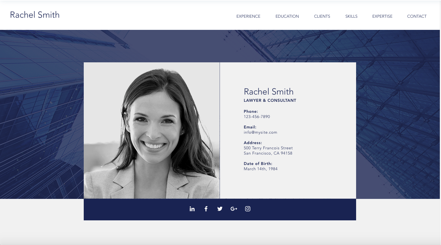
The choice may be baffling to some, but I see potential in the idea; however, it may mean a change in approach as to what I write about when it comes to the events and histories of the North East. I think it would be best to instead focus on one particular historical period or event of the North East, rather than a broad, all-encompassing historical website, as there are already websites for that. So now the question remains: what historical period or event would be best to focus on when concerning the North East? There are a few in mind:

  • North East England during WW1 or WW2.
  • Penshaw Monument and its history.
  • Coal mining industry in the North East.

I find the history of Penshaw Monument, as well as the person it was built in honor for, quite interesting in aspect.


John George Lambton, 1st Earl of Durham, (12 April 1792 – 28 July 1840) was a British Whig statesman, colonial administrator, Governor General and high commissioner of British North America. He was a founding member and chairman of the New Zealand Company that played a key role in the colonisation of New Zealand. Also known as "Radical Jack", he is commonly referred to in Canadian history texts simply as Lord Durham. Lord Durham died at Cowes on the Isle of Wight in July 1840, aged 48, and was buried at St Mary and St Cuthbert, Chester-le-Street. The Penshaw Monument in County Durham, on a hill west of Sunderland, was built in his honour.

Having only recently learned of the Earl myself, I think it would be nice to bring light as to the origins and purpose of the monument, as well as the man it was dedicated too. I took original photos of the monument to use for my website. The following are those photos:


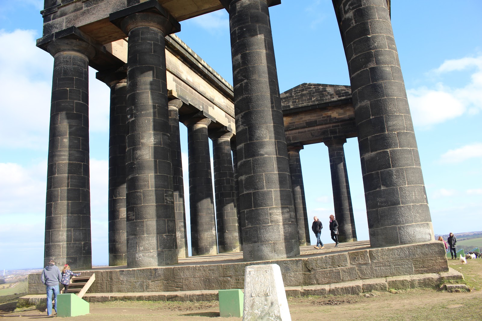
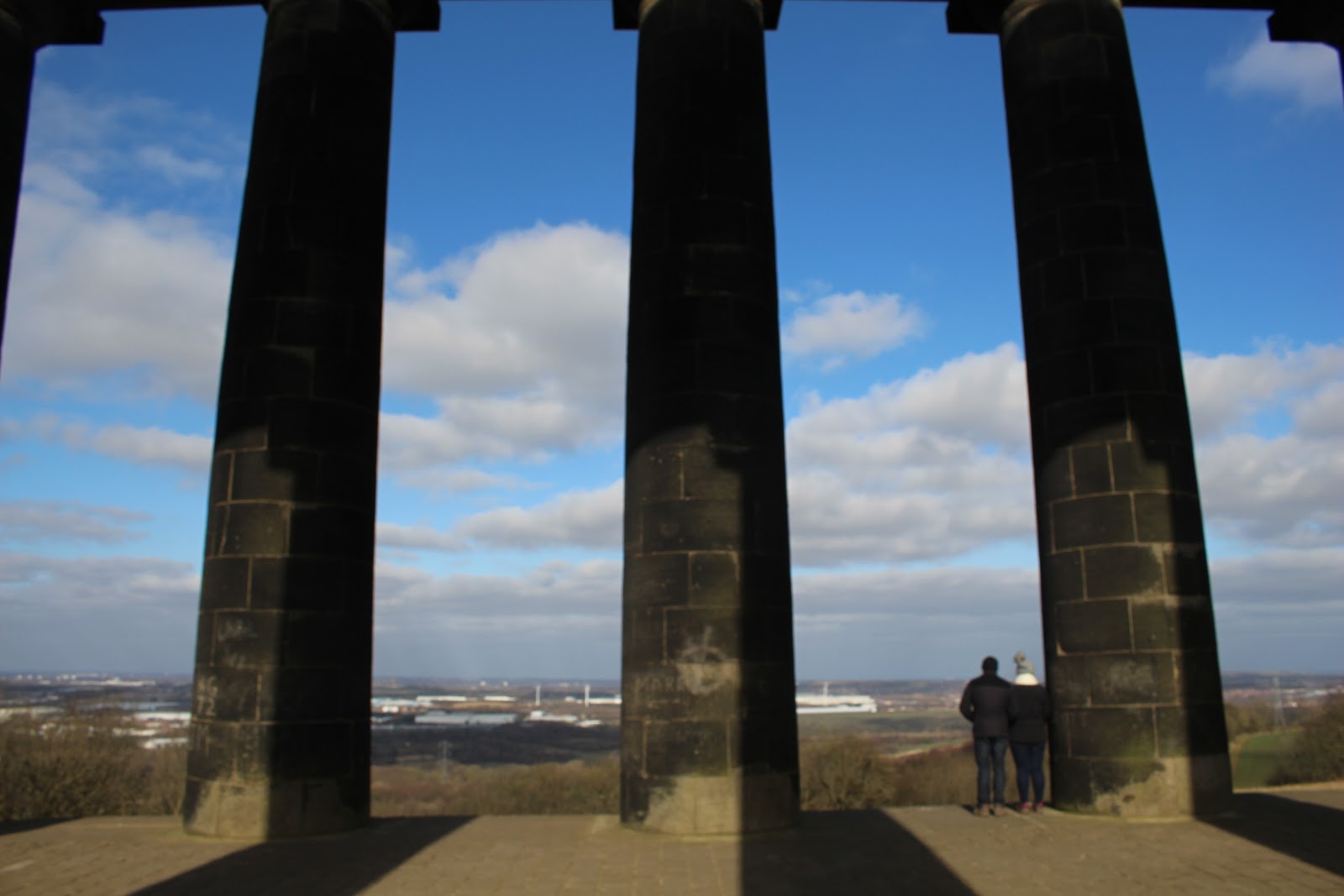
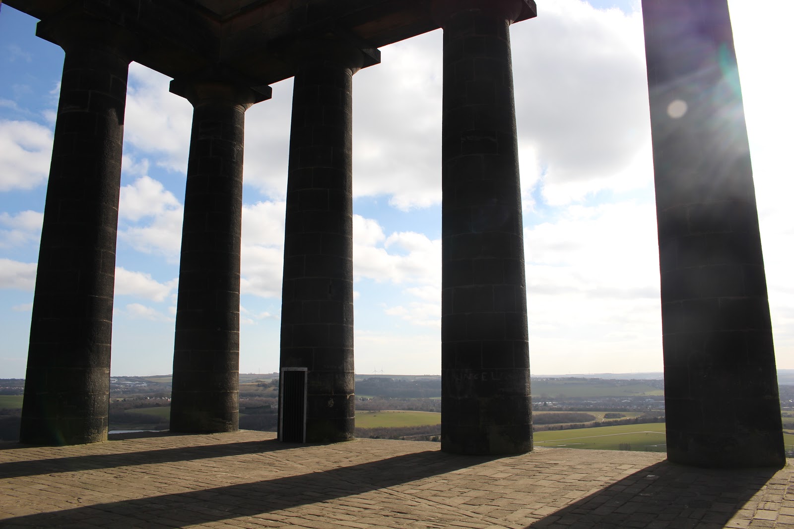
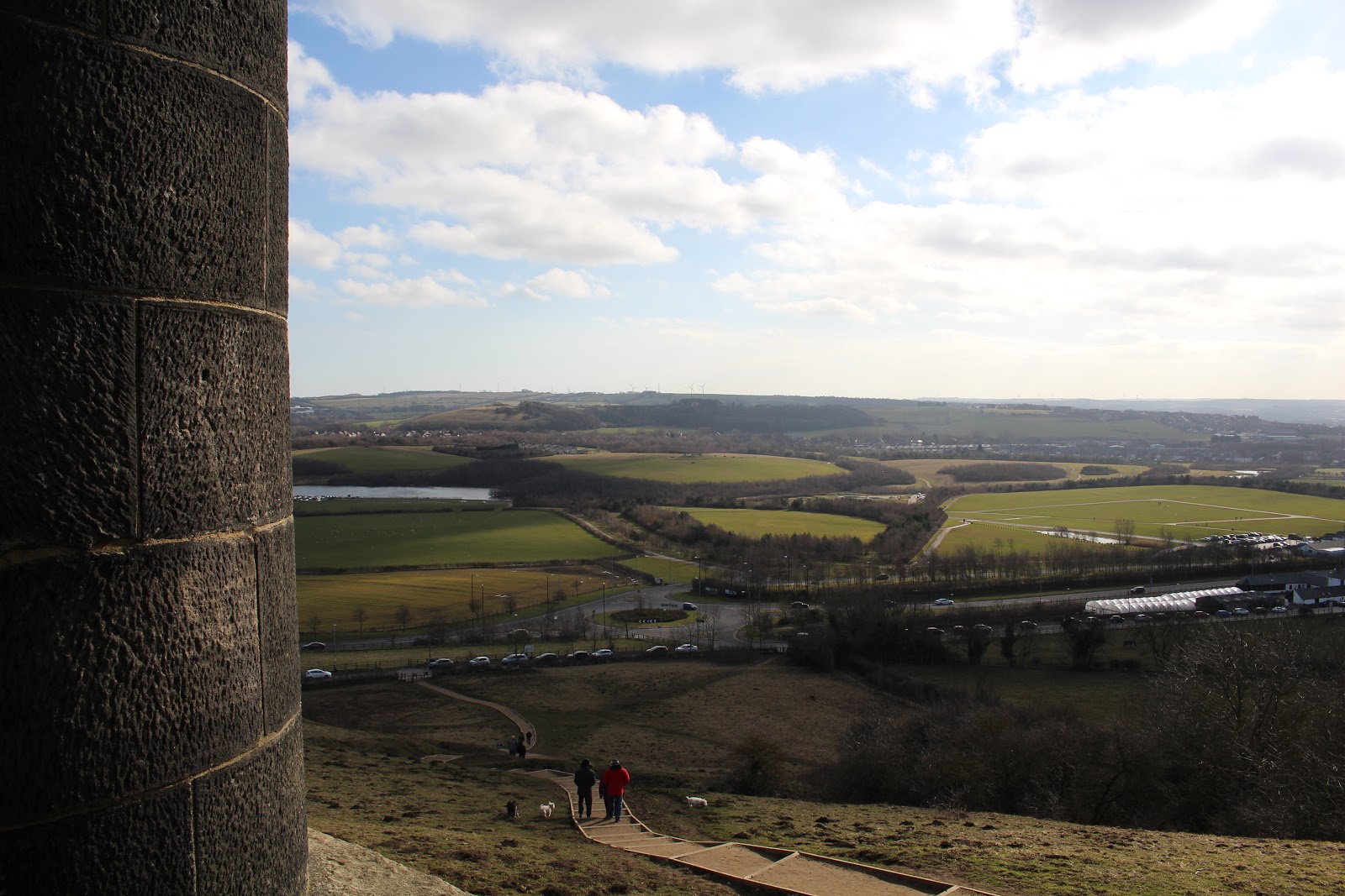
These will be important, as most photos of Penshaw taken by the BBC are under copyright law. Besides, original photos are the best way to go as this shows my dedication to the project. These are photos of my initial draft of the website:


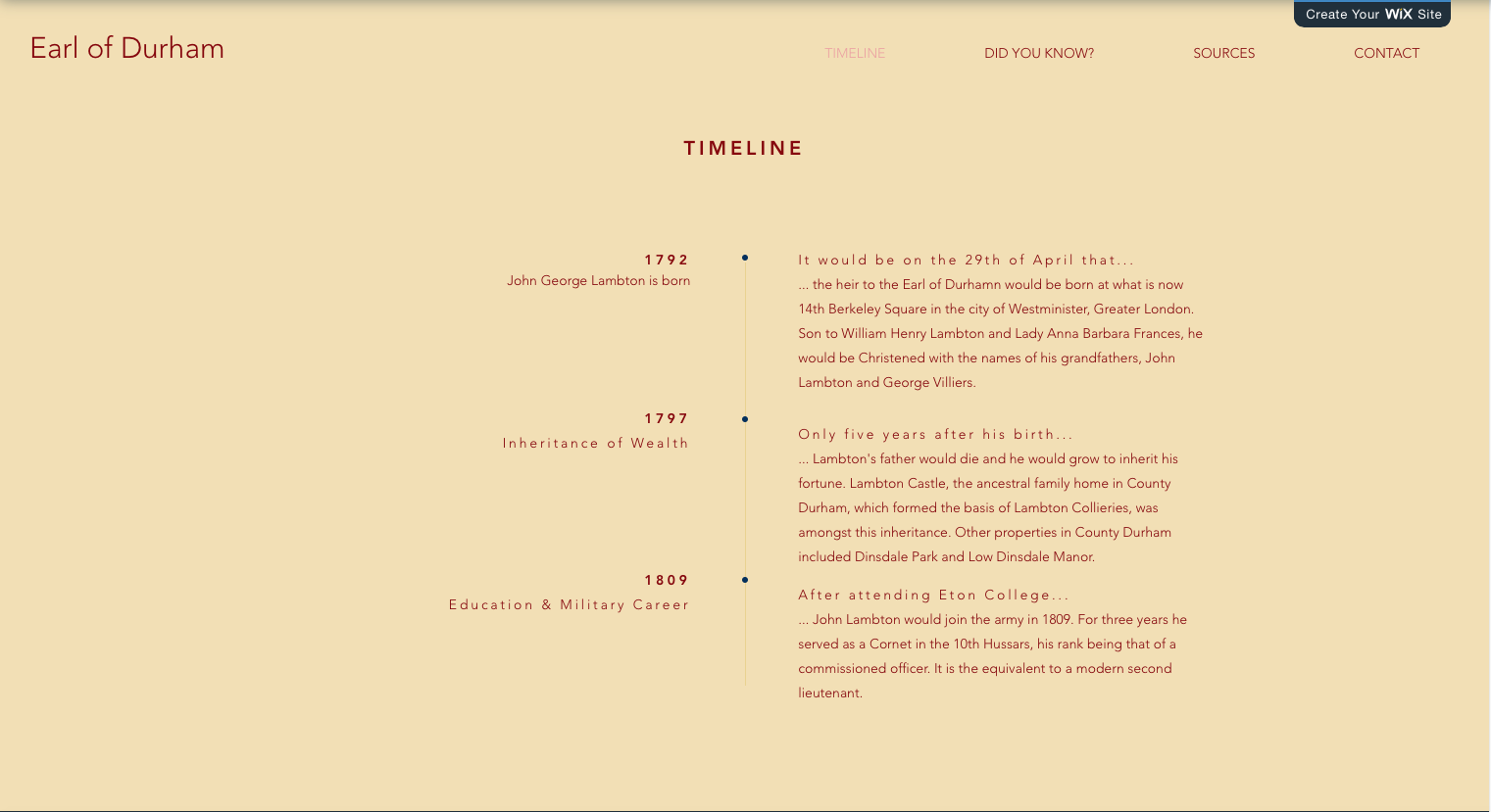
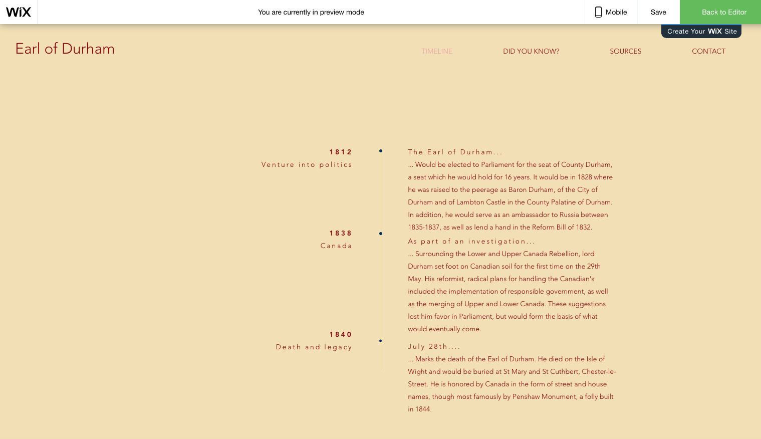
The following photos were used for the website:


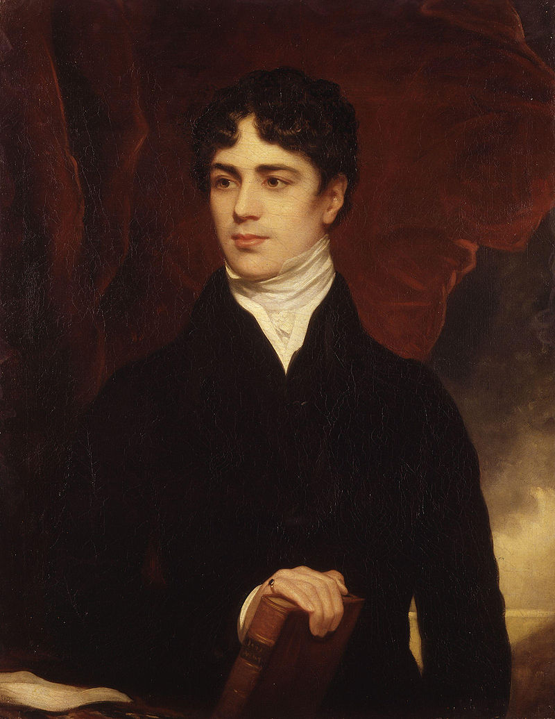
The portrait, sourced from Google images, was obvious for a visual representation of the Earl of Durham. As for the top right photo, I used this as a background photo for the top page. As for the lower left, this is part of the ‘Did you know?’ section, and reflects a nice shadow of the monument, almost matching the desired theme of the section, offering what people may not know. As for the last image, the plak I think looks nice when scrolling the site, as it is readable when scrolling up and down.

As for the rest of the images, I could add a gallery section in order to exhibit the rest of my photos, in order to give a better presentation of the monument for visitors and tourists. Wix, being mobile friendly as well, means this website offers a unique app for visitors or tourists to the site. This could work well into the tie-in with the BBC, who can advertise the product on their own website and through ads.

Overall, when comparing to initial ideas and plan, the concept has changed drastically, from a full history on the North East to a more niche website focused on the Earl and Penshaw.

Feedback

The following is written feedback from my peers, as part of the assignment.


Positive comments include:
  • Nice colour scheme
  • Good use of images
  • Very informative on local content
  • Neat layout and design
  • Professional looking history site

Critical feedback includes:
  • Links to possible historical videos or documentaries
  • Use of more methods in order to express the content i.e. videos
  • Use videos to show off the areas described
  • More photos

Overall I’m quite pleased with the feedback. The dominate request appears to be a link to any possible videos or documentaries related to the historical context. In addition, a request for more images is also asked of, and it could be that I could implement a photo gallery for unused images of the monument. Having reflected, I think I have done a great job of getting over the historical information of the website, and in turn achieved the theme of the north east, as it was a niche website on local history.

Friday, 12 January 2018

Sourcing Images for Magazine DPS

NOTE: my PEER assessment only remarked that I should put in my own opinion, which felt I did since this is a movie review. Apart from that I wasn’t given much constructive criticism to work off of.Thus, I have no been able to base much else off of my critiques when it comes to my magazine. 
However, after looking over the assignment brief, I needed to include original photos, and I decided to remove text in favor of an author’s photo and description, as seen below.


Because I completed this double page spread for my magazine, I was unable to screenshot progress (now available); however, I can explain the origin of images and their use, source them as well as explaining the why of things when it comes to page layout and design. Source: http://filmmakermagazine.com/88485-the-sound-of-helicopters-in-apocalypse-now/  


The background image of helicopters with a burning sun is perhaps the most iconic imagery to come out of Apocalypse Now, as it has remained culturally relevant. Below is an example of the cultural significance of the image:


May 1, 2010 cover of the Economist newspaper, illustrating the 2010 European sovereign debt crisis with imagery from the movie, attests to the film's pervasive cultural impact. The image was a must have as it connotes the movie and Vietnam setting/location. As for how I prepared and prep the image, I made sure it was cropped and sized appropriately using Photoshop tools, enabling it to take up half of the top page.


The original image serves as the author’s photo (myself) and below is text detailing the author themselves, the background with books connoting me being smart because I'm suppose to be a reviewer and their suppose to be smart. The rest of the body of text takes up the page. Unfortunately I couldn’t apply a pull quote due to the tight space. The need for an original photo diminished the amount of text as originally shown here. I resized the image in Photoshop to be appropriately small in order to fit in with the rest of the text neatly, having already had to remove some text in order to make it fit.

Other images I happened upon, but ended up not using include the following:


Source: https://www.rollingstone.com/glixel/news/the-new-apocalypse-now-game-will-be-survival-horror-w462797

The reason I objected to the use of this particular image as a background for my DPS was because I wanted the title text to be separate so I could have more freedom to move around and customize the landscape. 


Source: http://rubinmuseum.org/events/event/sound-apocalypse-now-07-07-2017 

Another potential background for the article. I was tempted by it but found a far more clearer and focused image of the iconic helicopters plain across a rising sun.


Source: a profile pic of my original making, taken by a friend. It was one of the pictures to use for the author picture, but opted for an alternative close-up, more clear cut and visible. 

Friday, 8 December 2017

UNIT 52 Assignment: Factual Writing

Instruction Article Analysis
The following article is an instruction piece, courtesy of Reading Rockets (http://www.readingrockets.org/article/do-you-see-what-i-mean-visual-literacy-supports-students-disabilities).


The headline, Do You See What I Mean? Visual Literacy Supports for Students with Disabilities, gives a rhetorical question followed by the purpose of the piece: to give instructions on guidance for students who need help when it comes to visual literacy. It then opens with the following slug to introduce us:


Many learners with disabilities are visual learners and are best able to understand and remember content when they can see it represented in some way; in other words, they need to “see what we mean.” Three visual supports helpful for teaching and supporting literacy development are described here: picture books, graphic notes, and story kits.


This paragraph introduces us to what the article is hinting at when it comes to the content. It explains how learners with disabilities are best taught in a visual manner in order to help them remember what they are being teached. This helps the reader understand what the purpose of the instructions is, and it applies to the intended target audience (teachers, tutors). It helps to serve as a go to manual for those in the profession of education.


The first official paragraph on the article starts off similarly as the semi-slug, though gives more context to the subject matter. “Many learners with disability labels are visual learners and are best able to understand and remember content when they can see it represented in some way… Some of these ideas may be effective for working with some students with disabilities and each may be used as catalyst for designing literacy lessons that are appropriate and challenging for learners in the inclusive classroom.”


Language is informative as it intends to explain and instruct the reader, as shown here when saying “Some of these ideas may be effective”, making sure as to not guarantee success. This somewhat makes the article more reliable, as it is honest that not all techniques could work, depending on the learner being taught. Of course, this article takes its sources from the following references, of which are from professional studies undertaken on the topic of visual learning disabilities:


Byars, B. (1981). Summer of the swans. New York, NY: Puffin.
Cherry, L. (1992). A river ran wild: An environmental history. NY: Gulliver Green.
Downing, J. (2005). Teaching literacy to students with significant disabilities.
Thousand Oaks, CA: Corwin Press.
Steinback, J. (1937). Of mice and men. New York, NY: Penguin.


This too also helps back its credibility as a source for those in education to use when it comes to dealing visual learners. In addition, some of the references serve as examples for when a teacher has used a particular book/novel for its theme purposes in order to teach learners about a particular topic. One of the examples is the following: “...a middle school science teacher used A River Ran Wild: An Environmental History (Cherry, 1992), a story about the Nashua River of New Hampshire, to teach all learners in the class about conservation and pollution.”
It explains that books with pictures (visual representation) help those particular learners having problems taking in the information. This too gives guidance to the reader as it informs them on a technique they can employ in order to help learners having difficulties remembering what is being taught.


Because the article serves as an instruction manual, it has now bias nor offers any arguments for or against, as its only intention is to give an objective way of handling the problems that comes with visual learners. Thus, this frees the article up more as it also intends to ensure the reader that the sources cited are of professional standard and adhere to what the content is meant to teach.


“For students with more significant disabilities, for those who are blind or have low vision, or for those just needing a more concrete way of relating to a piece of text, teachers might consider the use of story kits as a tool for improving literacy learning.”


Take note of the words. Teachers “might consider”, meaning this is one of other solutions to use when it comes to dealing with visual learners. It does not promise anything but only informs the reader. Indeed, the various methods include picture books, story kits and visual notes in an effort to help educate struggling students.


The article concludes with an appropriated headline named “Conclusions” which draws forth the discussion of strategies and what tools can be used to help develop learners. It ends with a note at the bottom about the author of the article: “This article is from the website of Dr. Paula Kluth. It, along with many others on inclusive schooling, differentiated instruction, and literacy can be found at www.PaulaKluth.com. Visit now to read her Tip of the Day, read dozens of free articles, and learn more about supporting diverse learners in K-12 classrooms.”


Following the link to Paula Kluth’s website lends credibility to the article’s author, as it verifies that Kluth works within the education system and helps children in various communities, with varying learning difficulties. As for what this does for the article itself, it helps to serve as a sort of reference and assure the reader that the author is an expert on such matters being discussed in the content.


Going back to the language, some may notice it is very specific to the area’s content, with words such as ‘learners’, ‘support’, ‘literacy’ and ‘teaching’ being commonly used. It makes the article seem more informative as it is enforced by this specific dialect that can be best identified as “educational”, as it links back to what you may expect when one comes to read instructions on how to handle learners with visual learning disabilities.


Leaflet Analysis
The following article is a leaflet, courtesy of the NHS (https://www.england.nhs.uk/nhsidentity/examples/nhs-patient-information-leaflets/).


The nature of this leaflet is to offer information concerning the NHS’s new way of “documenting nursing care”. Thus, this leaflet is suppose to remain unbiased by nature as it comes from a institution designed to help people. Language is precise and clear, and it specifies the area (Kingston Hospital) is “using a new system to store Nursing Documentation.” However, the leaflet fails to expand upon this and instead advises the reader to chat with one of the hospital’s nurses.

As for the intended reader, this is for anyone who so happens to be in Kingston Hospital, be they a patient or visitor. Because of this, there is no intend target audience, other than those in waiting or seeking medical attention. Further explanation is given: “Every bed space has a Nurse Documentation Folder where your nursing care is stored.” This means a patient can view details of their care from their own bed space and enlighten themselves to what care they are receiving. This is important information as it can educate the patient and/or their family or friends.

Any issues needing to be addressed (i.e. information on Nursing Documentation Folder) is only partially mentioned, instead directing towards a member of staff. Still, it gives directions and can help anyone needing assistance on the issue of Nurse Documentation Folders. Since this is only an informative leaflet, it does not have any typical bias or for-and-against arguments. This is to be expected given the nature of the content and the source.

Colour fits the standard scheme of the NHS, with white and blue being the prominent colours, with accompanying shades of black, grey and green colour. It makes the design neat and easy to identify; would one look at this if it had red and black colour scheme and think it were an NHS leaflet? My point being that it fits in well with the environment that is Kingston Hospital.

As for other ways of instant recognizability, one may look further at the leaflet as it contains a running head logo of the NHS, as well as pay attention to the language used. Words such as ‘nurse’, ‘care’, ‘patient’ and ‘assessment’ are mostly associated with medical institutes such as the National Health Service.

As for location of text, it is arranged mostly in the centre of the pages exhibited. The first page, introduced with a “Welcome” headline (indicating the leaflet is indeed intended for visitors or patients entering Kingston Hospital), followed by an introductory paragraph (a sort of kicker) explaining the hospital is using a “new system to store Nursing Documentation”. Additional information for the different sections of nursing delivery when it comes to care for patients.

The middle page is accompanied with the title “Communicating with you” and contains a diagram with the circle in the middle containing the text “Patient”, with alternate boxes panning out, forming a spider diagram. The example shown however, merely contains the same random text, as this is only a prototype version meant to only be shown off online. Still, one could assume the additional circles are meant to detail the various ways patients can communicate with NHS staff.

As for the third page, the headline “Information” informs the reader on the hospital’s implementation of the new way of documenting nurse care in a folder. “Please feel free to ask any questions” is used to end the paragraph, indicating the openness and freedom patients or their family/friends have when it concerns the nature of care they or their loved ones will be receiving. What is also worth pointing out is the running head logo of the NHS located on each page at the top right-hand corner, with Kingston Hospital giving us the location of the specific institute.

No credits are necessary as the NHS are commissioned to authorize such a leaflet in order to spread news of its news way of handling nurse folder documentation. Talking about a lack of certain elements, one could criticise the lack of information concerning the Nurse Documentation Folder. What is a NDF? We know we are advised to speak with a nurse further on the matter but shouldn’t we know more beforehand? What if the patient is new and has no idea of this routine? How does it affect them?

Regardless, the leaflet contains tropes of most typical leaflets and is appropriated for how it is used.

Magazine Article Analysis
The following is a magazine article, courtesy of ActiveRain (http://activerain.com/blogsview/2472313/featured-in-a-local-magazine-article-about-blogging)


The headline, “To Blog or Not to Blog?” acts as a sort of rhetorical question for the reader, but is followed up by a speech bubble saying “That is the question”. This gives us a good idea on what the article will be about: the benefits of blogging. The standfirst then gives us additional information to work with.

“Millions of people from around the world are creating sites that highlight their life and interest. Jamie Miles explains how we can get in on the fun.” The article introduces us to one Jamie Miles, who will be explaining how one can get in on creating their own blog. These types of articles, giving advice and tips, tend to pop up in many lifestyle magazines, so this is appropriate for the type audience.

Before we discuss audience, however, we should check over what type of magazine this is. The article comes from Flair Magazine, a local women’s lifestyle magazine that often gives tips and tricks on hair and beauty, as well as give out the latest news and gossip. The demographic is thus women, and judging from the images used in this article, often adult to middle aged individuals. Because of this, I think is safe to assume that Jamie Miles is a female blogger.

So now that we know the target audience predominantly female oriented, we must ask the following: how does this article draw in such a demographic? First off, the images of two female women hint at the femininity of the article, as well as the fact that this magazine would most likely be picked up by a female. Apart from that though, what else is there?

Now is high time to disregard simple things like pink means girl. Because the colour scheme of the article is blue and white with black text. Additional images include a computer with tabs of blogs being advertised, adding to the nature of the article being about blogs. Apart from this, we have and ad that immediately separates itself from the rest of the article with its bold black layout. Art of Oconee is advertising stores.

Because of this, the magazine and article are relying on its own merits to drawn in their target audience. Though if you are a female legitimately interested in blogging, these typical male/female drawn-ins, such as colour or content, should not rear your head. Thus, the article applies to only those willing to teach themselves if they are interested in starting up their own blog.

Purpose is thus appropriated towards what the article is trying to teach. “Imagine connecting with women all over the world who share your infatuation for fun, fashion or fried green tomatoes with no 140 character limitations… Who blogs? Bloggers are anyone and everyone: women and men, professional and blue collar types.” Miles is teaching the reader that anyone can blog and that women can do it while connecting with others with similar hobbies and interests. She also adds, “To blog all you need is the burning desire to say something and online access.”

Looking at the language used here, words such as ‘imagine’, ‘infatuation’, ‘fun’ and ‘burning desire’ try to seduce the reader into this idea that you can create and build your own so long as you have the passion. It encourages and reassures the reader. As for the language itself, it does not remain as informative as any other tips and tricks style article would remain. However, this is usually the case as these types of articles tend to try hype up the reader and get the idea into their head that they can accomplish what is being discussed.

That is not to say the piece is biased, but it is an opinionated one, as it is trying to get the reader invested into the idea of blogging. Case in point, Miles introduces us an expert’s opinion. “Margaret Murphy, whose Madison-based consulting firm helps corporations and individuals increase their influence, says that blogging has matured in the last decade.” This is meant to give a sense of credibility to the article, as the expert goes on to say:

“Readers have become scanners and gazers. Not many people can sit down and read a long involved blog post… These days Mommy bloggers are being represented by agents, who are selling the mommy bloggers services to large corporations.” This profitability will no doubt appeal even more to those already interested in blogging, and entice those who weren’t.

Because of the nature of the article there is no issues discussed in terms of side being taken. The only bias it may have is in its advocating for blogging, as it tries to pitch it towards the target audience. In order to pitch such an idea to the reader, questions are posed. “Is it going to be a personal blog journal?” These help the reader form an idea on what they want to achieve if they should set out to do their own blog.

Newspaper Article Analysis
The following article is a newspaper piece, courtesy of the Daily Express (http://www.pressgazette.co.uk/how-the-uk-papers-covered-historic-signing-of-article-50-letter-starting-brexit/).


The Daily Express is often aligned with the UKIP Party in terms of political stances, as the headlines suggests: “DEAR EU, WE’RE LEAVING YOU”. Though you could argue that the headline is neutral, given the coverage of Brexit by the Daily Express, you can say that this headline is indeed in favor of the result. Because of this, it is safe to assume the Express has a bias on the issue of Brexit.

The newspaper itself is a declaration of the result of Brexit, thus informing the reader. As the paper is UKIP supporting, it is majorly right wing, thus bringing in such readers. Courtesy of Statista:


This statistic shows the print and digital reach of the Daily Express and Sunday Express in Great Britain from April 2016 to March 2017 by demographic group. Reach was higher among adults aged 35 or over than among younger adults, with 4.38 million adults over 35 reached by the Daily Express or its website.

The subhead, “Theresa May’s No-Nonsense Message To Brussels”, hints at the newspaper’s stance, as word choice such as ‘no-nonsense’ can tell us that May’s response is the right one, as it does not make any effort to cover up the Prime Minister’s decision. An additional heading, acting as a title to the text of the article, reads the following: “PM signs letter to trigger our EU exit today”.

The main image used to accompany the cover page’s article is accompanied with text. “Picture of historic moment”, indicating the Daily Express think this a defining moment for Britain and thus worthy to be a part of history. The picture itself is of the PM signing the Brexit bill.

Below the banner of the paper is an ad for a story featured in page 7, exclaiming: “Outrageous! Wartime Landgirl, 95, Faces Losing Home to Pay for Care”. This story, given the use of language, is meant to evoke anger from the reader, in order to get them to read on. The choice of the word ‘outrageous’ is a testament to this. The editor of the paper wants us to feel angered for this helpless old lady, who has been living in her home since the war (as it hints), but we are unsure which war this is. Most likely WW2.

To the right-hand side of the story we have an image of the elderly woman in question, which helps get the reader a visual of the woman in question. This could be used as an emotional tactic in order to invest readers into her story. We are seeing her up close and vulnerable. This can make for a relatability aspect for the reader, feeling sympathetic. This column is also accompanied with a large 10p sign, in order to catch potential readers eyes and make them buy the paper on cheap.

The issue of Brexit is a controversial one, one that has split the nation. How the Express handle this is in a very imperative manner. The decision to leave the EU is final, and the Express express this through the manner of language. Words such as ‘historic moment’ play into this, as if this was a once in a lifetime event that will forever have its mark on Great Britain. Mention of the decision to trigger the Uk’s leave from the EU is regarded as ‘no-nonsense’, as if this is part of business and we ought to get on with it. They regard the matter as a generally good decision for the country. As shown in the link:

The signing of the Article 50 letter that will trigger Britain’s exit from the European Union has dominated UK media front pages today.

The Times, Mirror, Express, FT and Telegraph all used a picture of Prime Minister Theresa May signing the letter in the cabinet room at Number 10… The Times ran the image with the headline: “The eyes of history are watching,” a reference both to the historic implications of the letter and a portrait of Great Britain’s first Prime Minister, Sir Robert Walpole, that can be seen hanging on the wall behind May.

The Guardian and i newspapers used a map of Europe that shows Britain being cut out of the picture… The Sun headlined its coverage “Dover & out” with the words running across the White Cliffs of Dover… The Daily Mail used one word: “Freedom” as it combined its Article 50 coverage with news that Marine A is soon to be released from military prison.

Only the Star did not run Brexit as the main story on its front page, opting instead to splash on an image of David Beckham in make-up for a new film. “

This, of course, compares news coverage by other papers in reaction to Brexit. However, there is nothing to hold against the cover itself, as it does not violate any known Editor’s Code of Practice laws, and thus people must comply with the fact that the paper is biased and in favor of Brexit. UKIP, which is supported by this particular paper, were the party which was largely responsible for the anti-EU campaign leading up to the referendum on a vote whether the country should remain within the European Union or leave.