DOUBLE PAGE SPREAD - EVOLUTION
The following are a series of screenshots with commentary accompanying them, explaining each stage.

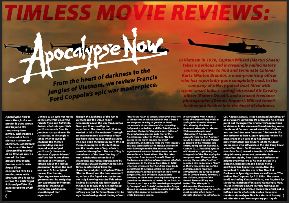
Reference 1. I started off with a black background with the main image already in mind. With that I first added in the numbers at the side to indicate a hypothetical page number, as well as bless the DPS with the magazine's title and the movie title. at this stage I was content enough with the fade effect for the title as it blended in well with the iconic main image from Apocalypse Now.

Ref 2. I added in the stand first explaining the plot of the movie, in order to give context to the reader. I put this in red to correlate well with the title of the article, as I felt it would compliment it well. As for the slug, I opted for a simple black bold text to contrast the white of the movie title logo.

Ref 3. The problem I encoutered early on with my DPS was a lack of original image, so I used an old profile picture of mine and added a little bio for the author. This was at the risk of cutting out part of the article text to make room, but it did't drastically effect the written work.

Ref 4. My finalized version with the magazine article text embedded. This is my final evolution of my double page spread article.
DOUBLE PAGE SPREAD - EVALUATION
I should make comment that my PEER assessment only labelled to put in my own opinion, which I felt I did since this is a movie review. Apart from that I wasn’t given much constructive criticism to work off of. So I’ve just had to resort to the current form.
However, after looking over the assignment brief, I needed to include original photos, and I decided to remove text in favor of an author’s photo and description, as seen below.

Because I completed this double page spread for my magazine, I initially was unable to screenshot progress; however, I have since went back and screen shot the progress, and I can explain the origin of images and their use, source them as well as explaining the why of things when it comes to page layout and design. Source: http://filmmakermagazine.com/88485-the-sound-of-helicopters-in-apocalypse-now/
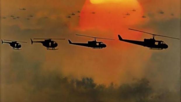
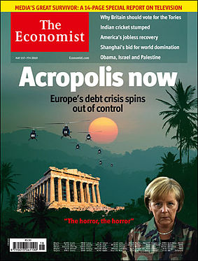
The background image of helicopters with a burning sun is perhaps the most iconic imagery to come out of Apocalypse Now, as it has remained culturally relevant. Below is an example of the cultural significance of the image:
The image was a must have as it connotes the movie and Vietnam setting/location. The logo of the movie, Apocalypse Now, is what I intended to use from the beginning. It is preceded by the name of the article, Timeless Movie Reviews, which is faded red to fit the theme of the background photo, this sense of entrapment in Vietnam, spiritually. The tag line below the movie title logo reads the following: From the heart of darkness to the jungles of Vietnam, we review Francis Ford Coppola’s epic war masterpiece. This gives a clear direction as to what the article will entail.
The standfirst reads as follows, giving a plot to the movie so the reader understands: In Vietnam in 1970, Captain Willard (Martin Sheen) takes a perilous and increasingly hallucinatory journey upriver to find and terminate Colonel Kurtz (Marlon Brando), a once-promising officer who has reportedly gone completely mad. In the company of a Navy patrol boat filled with street-smart kids, a surfing-obsessed Air Cavalry officer (Robert Duvall), and a crazed freelance photographer (Dennis Hopper), Willard travels further and further into the heart of darkness.

The original image serves as the author’s photo (myself) and below is text detailing the author themselves, the background with books connoting me being smart because I'm suppose to be a reviewer and their suppose to be smart. The rest of the body of text takes up the page. Unfortunately I couldn’t apply a pull quote due to the tight space. The need for an original photo diminished the amount of text as originally shown here.

Overall, I am quite pleased with the finished product; however, I do wish I made the template larger so I could fit on more, and that the body of text was more neat. However, it is probably best I compare my work to a professional piece, as to get and idea as to what that standard is like. The best example, I find, is the following.

Similar to my own, this DPS movie review has a dominant image take up half of the page, displaying a visual from the movie itself. Unlike mine however, the image is halving the page vertically, and the text is clearly defined well by space, unlike mine which seems to share the same air, in a sense that they are unboxed.
Colours seem to share the same scheme of the Spiderman costume and movie, light and somewhat cheerful, with light and dark blue contrasts with a prevalent white background with black text. This is very in tune with my own colour scheme, as the dark colours reflect that of the movie, with image complimenting the red & white text and black background. This is something both magazines seem to have in common.
As for text layout and design, the contrasts are apparent due to positioning and use of colours. My magazine name is faded in red and blends into the background of the main image, which is meant to reflect one of the themes of the movie, as the soldiers in Vietnam are spiritually and mentally trapped there, as emphasized by the movies use of fade cuts.
Unlike my own, my magazine lacks a verdict which could lead to some to believe there is a lack of finality with my piece; however, I would disagree. Everything you need know on my feelings of the movie is written in the article, and I don’t believe a grade, star rating or final verdict could summarize my feelings or thoughts on the movie.
Skills I have developed in the making and evaluating of this DPS are analytical skills that I believe I have picked up on well in the evaluation of my article, such as when comparing my magazine to a professional one. In addition, my use of Photoshop is only strengthened with constant use and practice. My use of colour scheme, in relation to the themes of the movie, I believe or my finest achievement. In addition, I find I’ve done well with the article itself and clearly articulated on why I believe this movie to be a timeless classic.
As for what I could have improved on, I believe the texture of the whole magazine could have been made to look more bold and professional, and less ameutrish. Also, while I’m proud with the use of colours, I feel as if it may be a bit too much for others. Likewise, the lack of space for text caused a problem, making it too small (especially when adding an original author’s photo). This will be problematic for viewing when on a large interactive whiteboard or otherwise.
No comments:
Post a Comment